
 Re-mark

Make Beautiful Tailwind Cards That Inspire Your Users In this article, we’ll explore how to create cards with Tailwind CSS, and add images and responsive designs. We also showcase practical examples to inspire your next project. What are Tailwind CSS Cards? Tailwind CSS Cards are versatile and highly customizable components that streamline the process of presenting data entries and information in a visually appealing and well-structured manner. Accordingly, these cards are designed to provide a clean and organized layout, allowing users to consume and understand the content displayed easily. Tailwind Cards List How to Create Cards with Tailwind CSS We can create a Tailwind Card by bringing multiple Tailwind CSS components together. So, we’re going to discuss some of the elements that make up a card in Tailwind CSS. The basic elements of a card include the following: Card container Card title Card description Card button Image Cover Create a Card Container The card container will be the wrapper of our card, and it’ll look something like the following:
Card Title
Card Description The card description contains more context about the card item, such as a category, group, etc. This also allows the user to know more about the title of the card.Card description
Card Button The card button allows us to create a CTA (call to action) within a card. Thus, this allows us to perform actions like add to cart or redirect the user to a product full page. Card Outcome Now that we know how to create a button, by putting everything together, our final card code will look something like below:Card Title
Card description
You may like
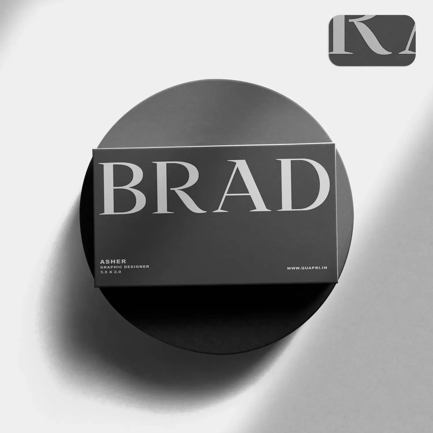
Matte Visiting Cards
#MatteVisitingCards, #MatteFinish, #ElegantBusinessCards, #SmoothTouch, #PremiumQuality, #CustomMatteCards, #ModernDesign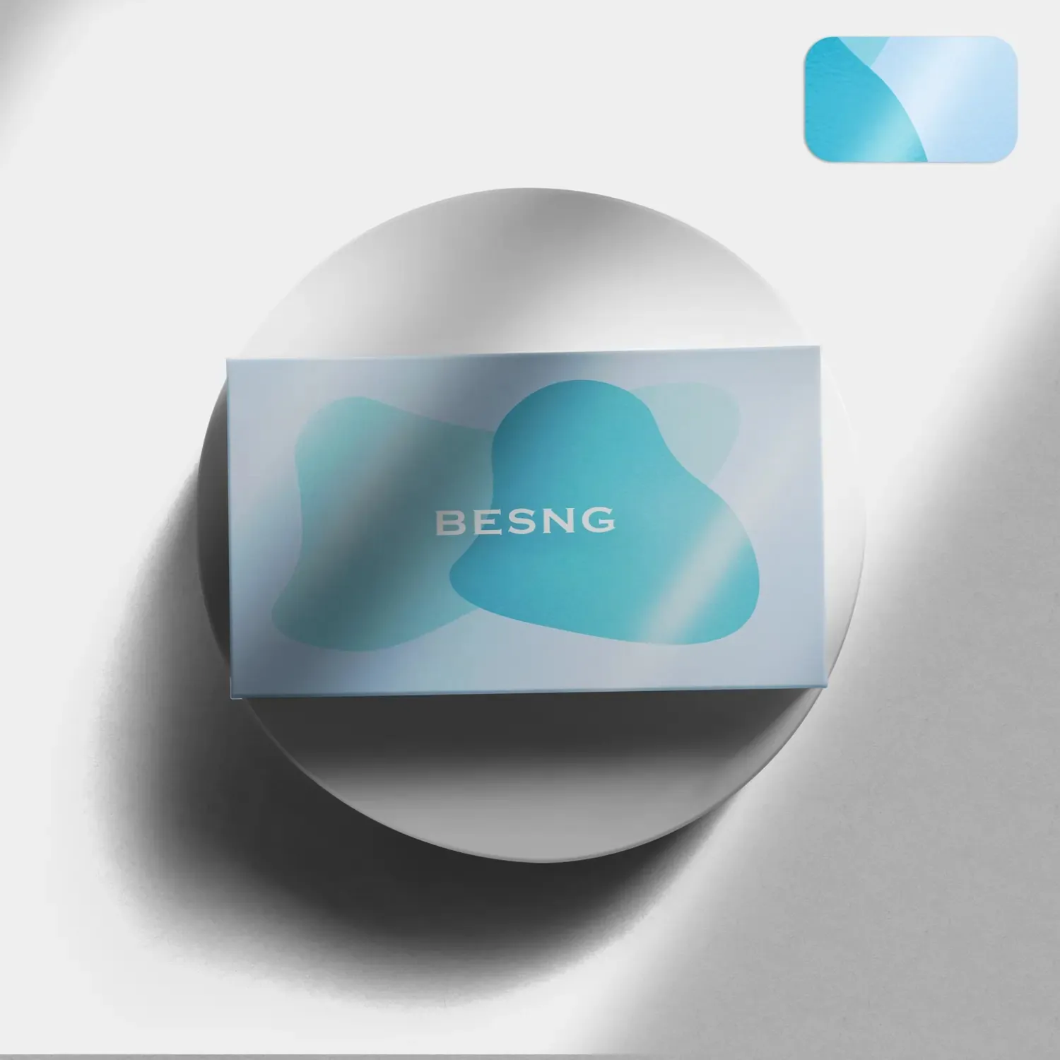
Glossy Business Cards
#GlossyBusinessCards, #HighGlossFinish, #ShinyBusinessCards, #LuxuryVisitingCards, #PremiumPrinting, #ProfessionalDesign, #VibrantColors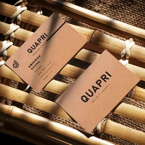
Eco-Friendly Business Card
#EcoFriendlyBusinessCards, #SustainableDesign, #RecycledPaperCards, #GreenPrinting, #EcoBranding, #BiodegradableCards, #EnvironmentFriendly